Using Tables for Layout: How to Build a Bulletproof* Table Using Transparent Pixel Shims
*Disclaimer: Note that nothing is 100% "bulletproof" when it comes to Web browsers and HTML.
This technique of using invisible tables for Web page layout, while still widely used, is no longer considered to be the best coding practice. Browser support of cascading style sheets has improved; now using CSS is considered to be the preferred method of page layout. But if you really need to use tables for layout, or understand the technique, read on. (By the way, using tables for layout is still the preferred method of styling HTML email. The most widely used email clients are a generation or two behind Web browsers in their CSS positioning support. So if you need to code a pretty email piece, this is the technique for you.)
This example demonstrates the technique commonly used to force Web browsers to consistently render HTML tables. This trick (sometimes called a "hack" or "kludge") keeps tables from collapsing, regardless of the contents of the table. Here we will use use pixel shims to fix the width of the table data cells, and thus of the whole table. Of course, you need to understand basic HTML table construction to use this tutorial.
This example is an oversimplification of the technique, made simple for demonstration purposes. For example, here we use a three-column layout. But normally for a three-column layout you would actually make five columns: three main columns, and two narrow gutter columns, one each between the main columns, to create space between the main columns (because cellpadding — the space within cells — and cellspacing — the space between cells — must be set to zero).
You will need a transparent pixel GIF. If you don't already have one, you can download a transparent pixel here.
Step 1 - With paper and pencil, sketch out a mock-up of the page layout.

Step 2 - Add a row at the very top of the table sketch.
When all is said and done, this row will be only one pixel tall, and will be invisible.

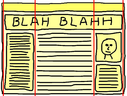
Step 3 - Define the columns.
Use vertical lines to define all possible columns, even if a line cuts through a row (as these lines cut through the row containing the headline).
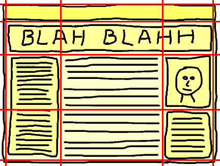
Step 4 - Define the rows.
Use horizontal lines to define all possible rows, even if a line cuts through a column (as a line cuts through the text block on the left).
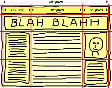
Step 5 - Define the column widths.
First decide how wide the entire table is to be. (In this example we will set the table width at 600 pixels, a size that is fairly narrow.) Then decide on all column widths, which of course when added up must equal the table width, excactly. Remember that each column must be at least as wide as any images that will be placed into a cell in that column.
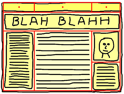
Step 6 - Refine the table structure.
Note that each column in the top row will become a cell containing an invisible pixel. Now erase the lines that cut through cells.
Step 7 - Code the table.
Now we can clearly see the underlying table structure.
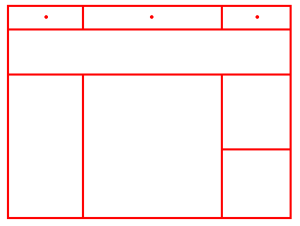
Note that this table is four rows by three columns, and that the first row,
reserved for the invisible pixels, will become only one pixel tall. Also note
that the table data cells in this top row will not contain any rowspan
or colspan attributes.
The width of the table data cells is set by using the width attribute
of the invisible pixel <img> tags, not by
using the width attribute of the <td> tags. The cellspacing,
and cellpadding attributes of the <table>
must be set to zero, and the width attribute of the <table> must
be set to some fixed number, such as 600, 800, 1000, or whatever. The border must
be set to zero; in the code below, a local style is used to do this.
Here is the code for the above table:
<table style="border:0;" cellspacing="0" cellpadding="0" width="600">

<tr>

<td><img src="images/cleardot.gif"
  width="175" height="1" alt="" /></td>

<td><img src="images/cleardot.gif"
  width="300" height="1" alt="" /></td>

<td><img src="images/cleardot.gif"
  width="125" height="1" alt="" /></td>

</tr>

<tr>

<td colspan="3">CONTENT</td>

</tr>

<tr>

<td rowspan="2">CONTENT</td>

<td rowspan="2">CONTENT</td>

<td>CONTENT</td>

</tr>

<tr>

<td>CONTENT</td>

</tr>

</table>
The above code validates to XHTML 1.0 Strict.
Note that in this example the width of the table is fixed, not its height. You are usually much more concerned with the width than the height. To fix the height instead of the width, you can use this technique, but with an added column for pixel shims (with a width equal to one pixel) instead of an added row. If you wish to fix both the table's width and height (not recommended) you will need to be very careful to allow enough room for text in the cells to get larger without breaking the table structure.
Also note that for invisible pixels used as spacers or shims, the empty alt
value (nothing between the quotes, as in <img alt=""
src="cleardot.gif" /> ) is used. This stops screen readers
for the visually impaired from reading aloud meaningless alt text.
The CSS
Of course, it's better to put all styling in the CSS rather than in the HTML.
In the above sample code for the table, the HTML attributes of the <table>
element (width, cellpadding, and cellspacing) are used, as well as a local
style to remove the border. But it's cleaner to put all of this into the style
sheet. Here's sample HTML code to do this:
<table class="layouttable">

<tr class="shimrow">

<td><img src="images/cleardot.gif" width="175" height="1" alt="" /></td>

<td><img src="images/cleardot.gif" width="300" height="1" alt="" /></td>

<td><img src="images/cleardot.gif" width="125" height="1" alt="" /></td>

</tr>

…

</table>
Note that the table used for layout has a class applied to it called "layouttable" and the first row (the row containing the pixel shims) has a class applied to it called "shimrow."
Here's the CSS:
.layouttable {

        width: 600px;

        }

        .layouttable, .layouttable td, .layouttable th {

        border-style: none;

        padding: 0;

        margin: 0;

        }

        .shimrow td {

        font-size: 0;

        line-height: 0;

    }
Note that the cells in the row contining the shims have the line-height property set to zero. This stops these cells from growing taller than one pixel in height.
Tip: While building and modifying an invisible table to be used for page layout, it is very helpful to actually see the cell borders. To do this, add this rule to your CSS:
td {

  border-style: solid !important;

  border-width: 1px !important;

  }
Of course, while you are making the cell borders visible by making them one pixel wide, you are adding a few extra pixels to the width of the table, which will cause things to be slightly off. But this allows you to easily see the table structure. Then, when you have finished the layout and you no longer need to see the actual cell structure, remove the above CSS code to make the table invisible.
